TTEP.CN > 软件 >
如何用Excel做雷达图方法教程 Excel如何将数据做成雷达图技巧
如何用Excel做雷达图方法教程 Excel如何将数据做成雷达图技巧 看到雷达图的展示数据很好,想要将自己表格中的数据做成雷达图,该怎么制作呢?下面我们就来看看详细的教程,需要的朋友可以参考下。
1、首先双击桌面上的excel2010,启动该应用程序。
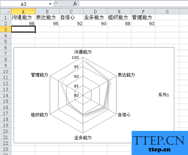
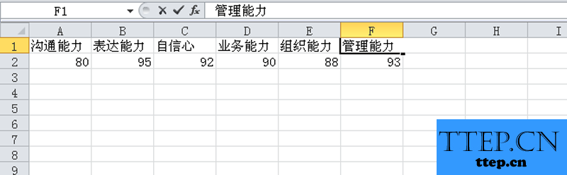
2、在单元格中输入相应的字段名称和对应的数值参数,根据实际情况进行设计。
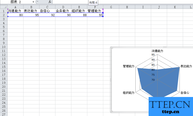
3、选择数据区域a1:f2,执行插入-其他图表命令,选择填充雷达图。

4、在图表布局中选择一个合适的图表,在图表样式中选择一个合适的样式。
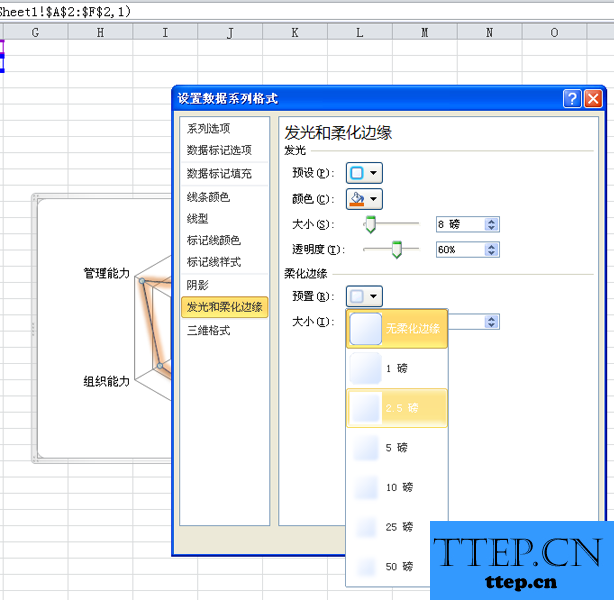
5、右键单击该图表,从下拉菜单中选择设置数据系列格式选项。
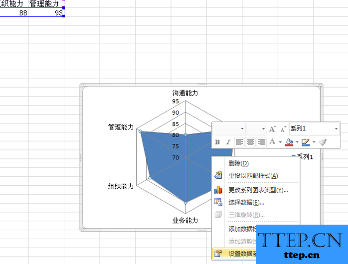
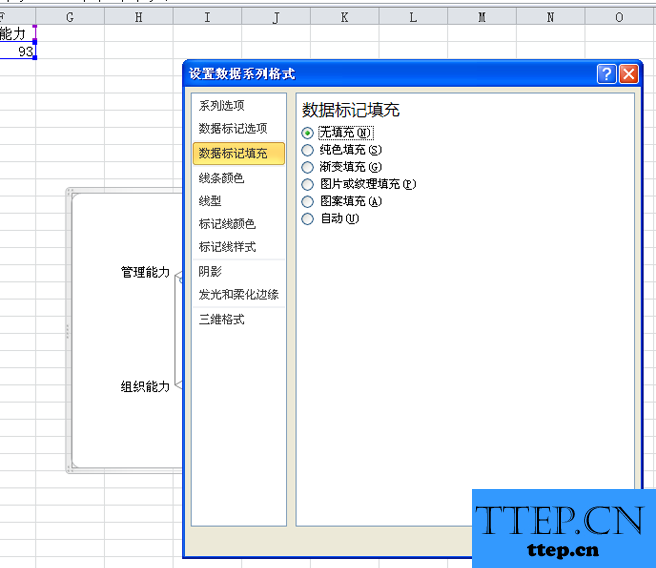
6、在弹出的设置数据系列格式对话框中,切换到数据标记颜色填充,选择无填充。
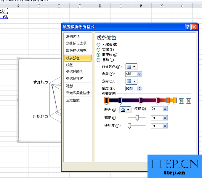
7、接着切换到线条颜色选项卡,勾选渐变色,然后设置相关的参数,可以根据自己的实际情况进行设置。
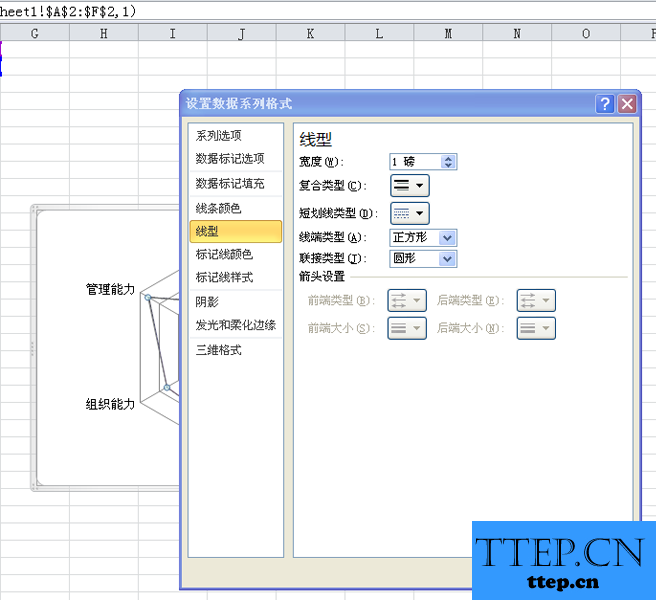
8、切换到线形选项卡,宽度设置为1磅,设置复合类型选项,线端类型设置为正方形。
9、切换到发光和柔化边缘选项卡,预设设置一种自己喜欢的,颜色选择绿色,柔化边缘预置为2.5磅,点击确定按钮。
10、这样雷达图就制作完成了,修改相应的数据你会看到图表的变化,可以根据需要进行调整。

1、首先双击桌面上的excel2010,启动该应用程序。

2、在单元格中输入相应的字段名称和对应的数值参数,根据实际情况进行设计。

3、选择数据区域a1:f2,执行插入-其他图表命令,选择填充雷达图。

4、在图表布局中选择一个合适的图表,在图表样式中选择一个合适的样式。

5、右键单击该图表,从下拉菜单中选择设置数据系列格式选项。

6、在弹出的设置数据系列格式对话框中,切换到数据标记颜色填充,选择无填充。

7、接着切换到线条颜色选项卡,勾选渐变色,然后设置相关的参数,可以根据自己的实际情况进行设置。

8、切换到线形选项卡,宽度设置为1磅,设置复合类型选项,线端类型设置为正方形。

9、切换到发光和柔化边缘选项卡,预设设置一种自己喜欢的,颜色选择绿色,柔化边缘预置为2.5磅,点击确定按钮。

10、这样雷达图就制作完成了,修改相应的数据你会看到图表的变化,可以根据需要进行调整。
- 最近发表
- 赞助商链接